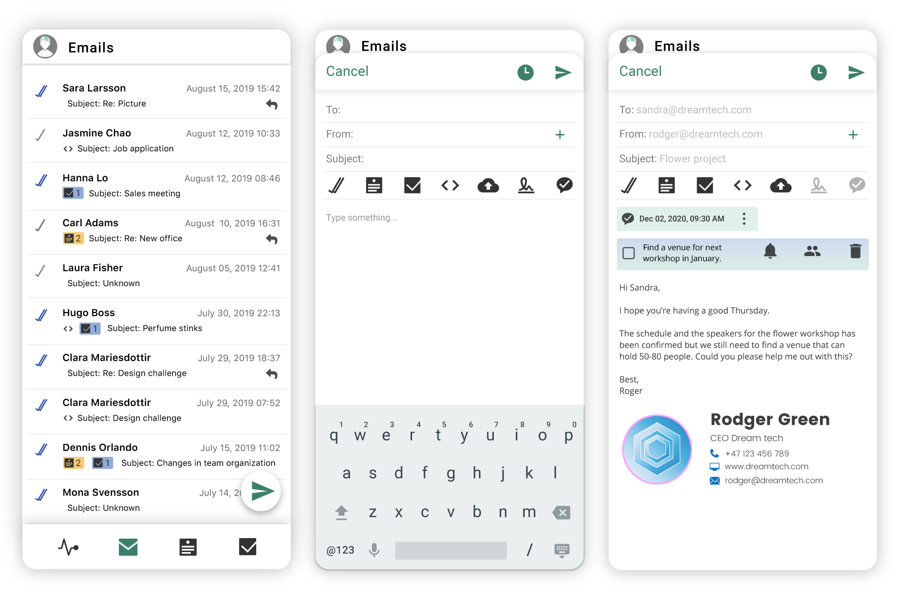
This app works as a mobile companion app to Mailbutler's web apps. It helps customers keep track of how their emails are performing when they are not in the office. As well as improve collaboration between teams within email management.
- My role:
I was the only UI/UX designer working with a team of two Developers, a Project manager, a UX editor and a Customer expert.
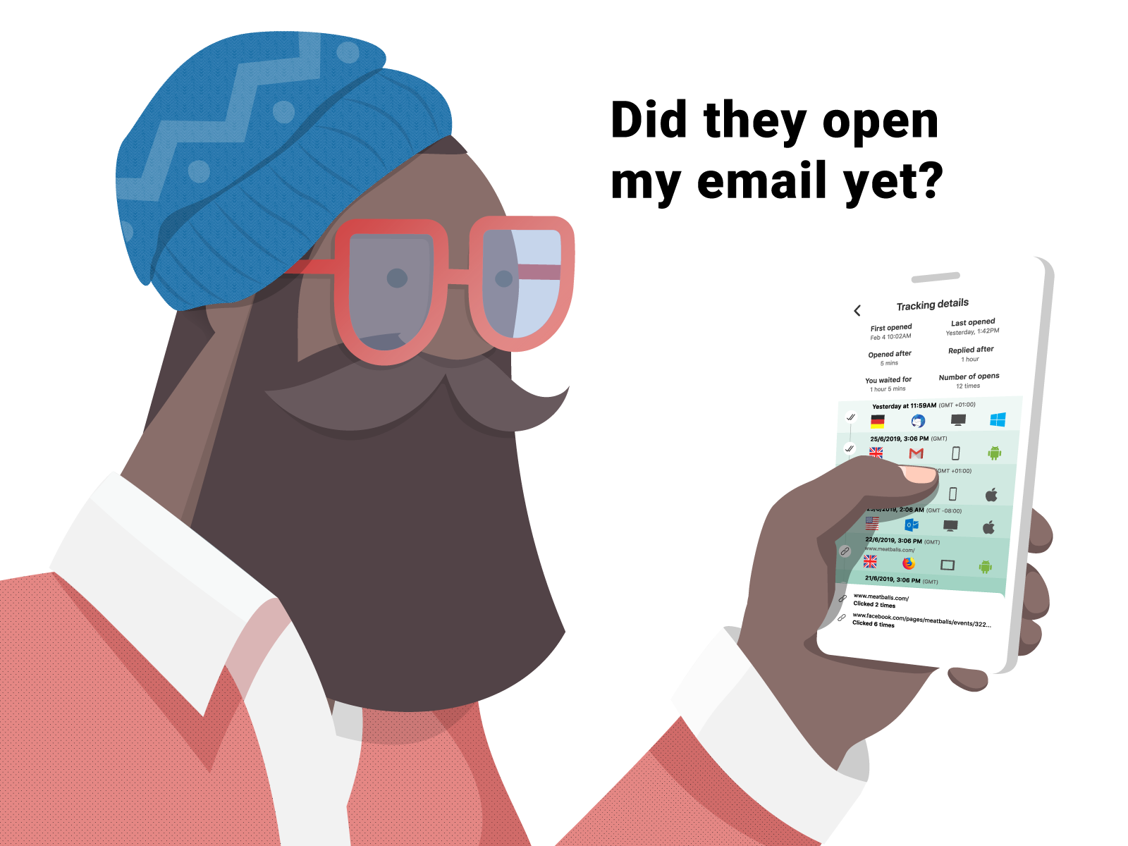
•In the first release, you could not send emails with Mailbutlers features within the mobile app for technical reasons. Customers had to use one of Mailbutlers web extensions for either Gmail webmail, Outlook, or Apple Mail to send emails.
• If customers did not use the web extension, the app could only show tasks and notes that had been shared with them by a team member.
• Mailbutler's previous UI components were designed only for the web and needed to be redesigned to also work with iOS and Android.
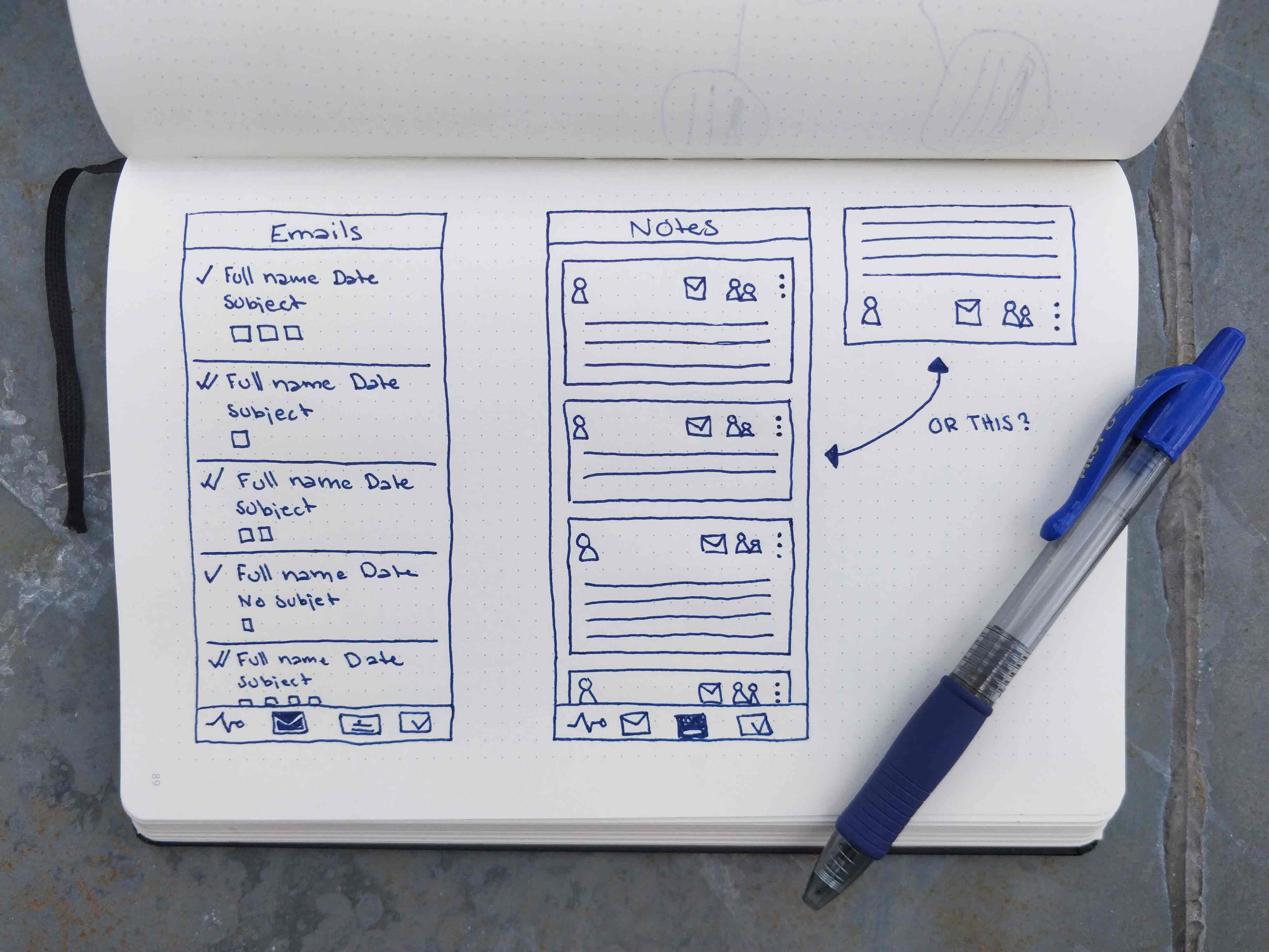
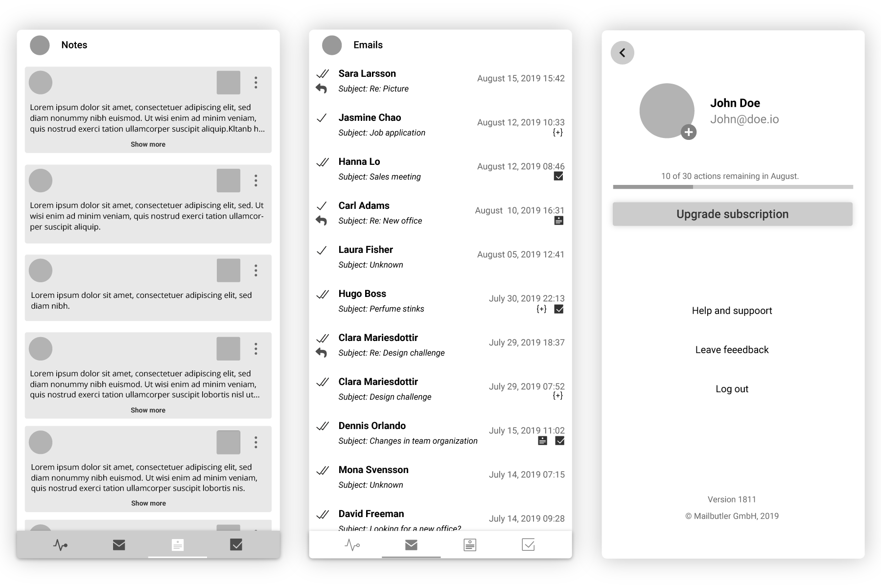
The design was based on Mailbutler's brand guidelines, insights gained from customer service, user data, competitor research, user testing on prototype and beta testing.
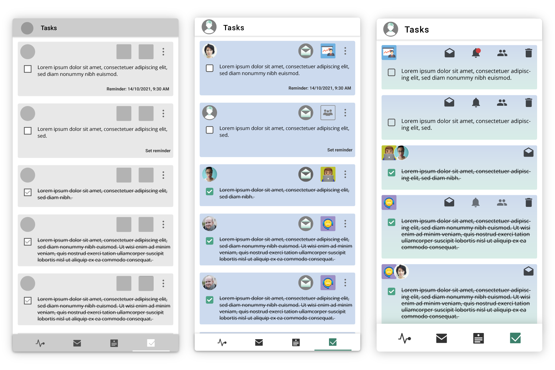
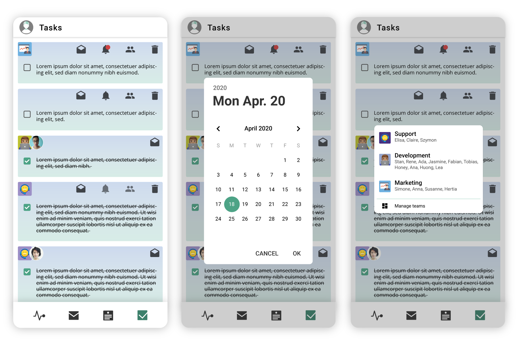
After consideration and testing, the overflow menu was dropped in Tasks. All the action icons were moved to the upper right corner, except for the checkbox to mark the task as done. The team/owner avatars are displayed as an indication of who shared the task and with what team. The bottom navigation bar was increased for easier tapping between destinations.
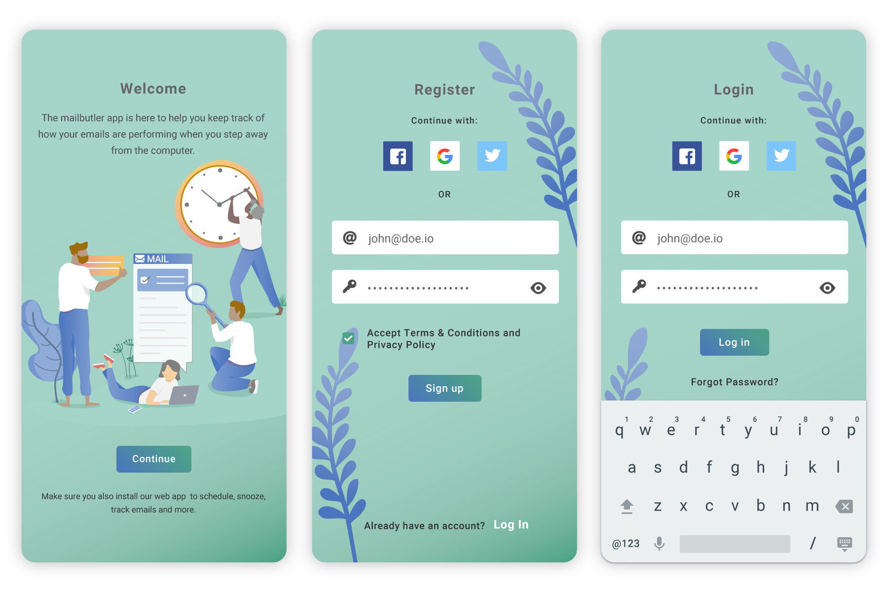
Once you have downloaded the app, a welcome screen appears, informing users that they also need to install the web app to get the full experience.
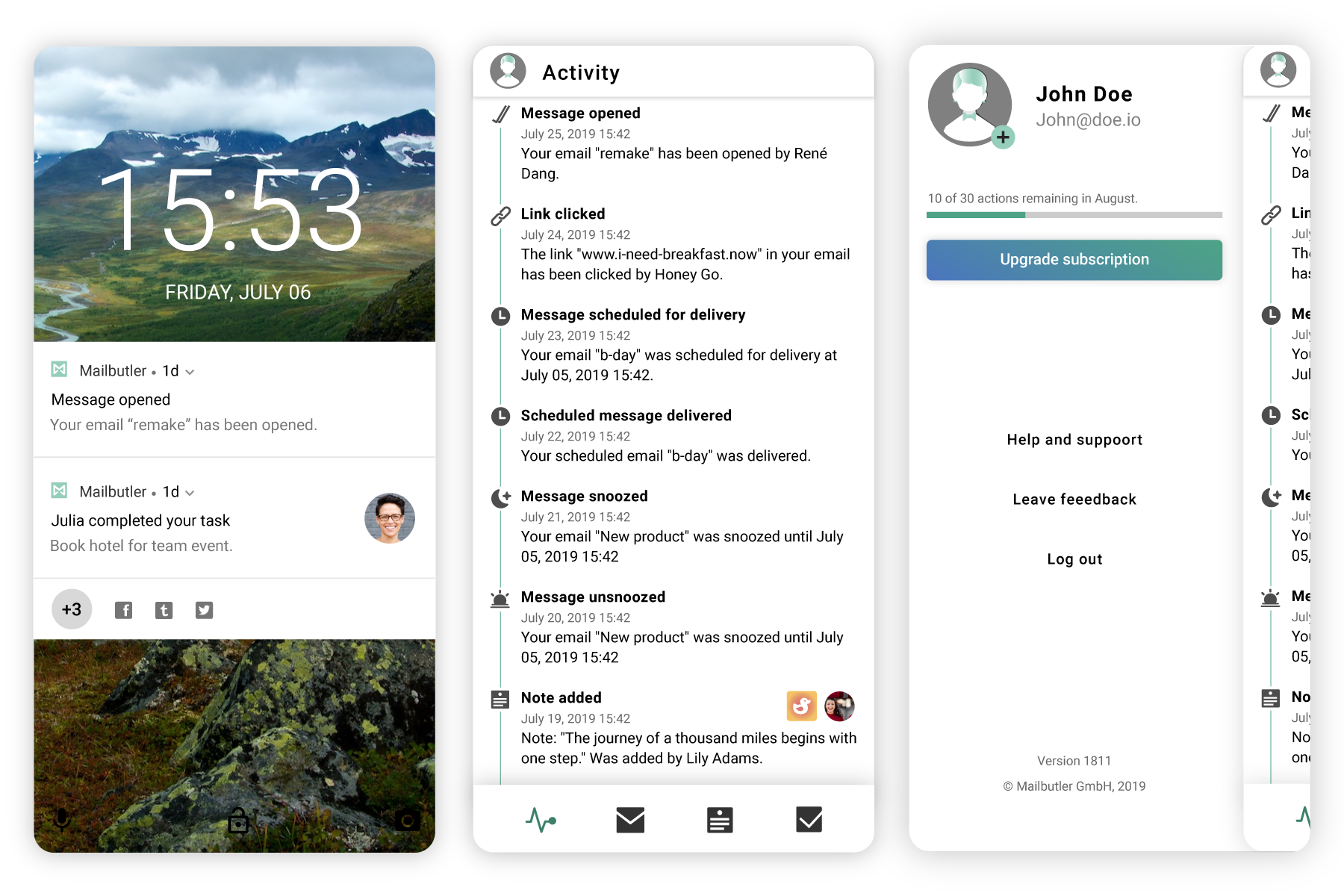
The app gives you notifications of the latest most important activity.
In the first tab in the app, you see the Activity feed, where you get a list view of all your activity.
If you click on your avatar in the top left corner you see actions remaining in your subscription plan, upgrade and links to support and feedback.
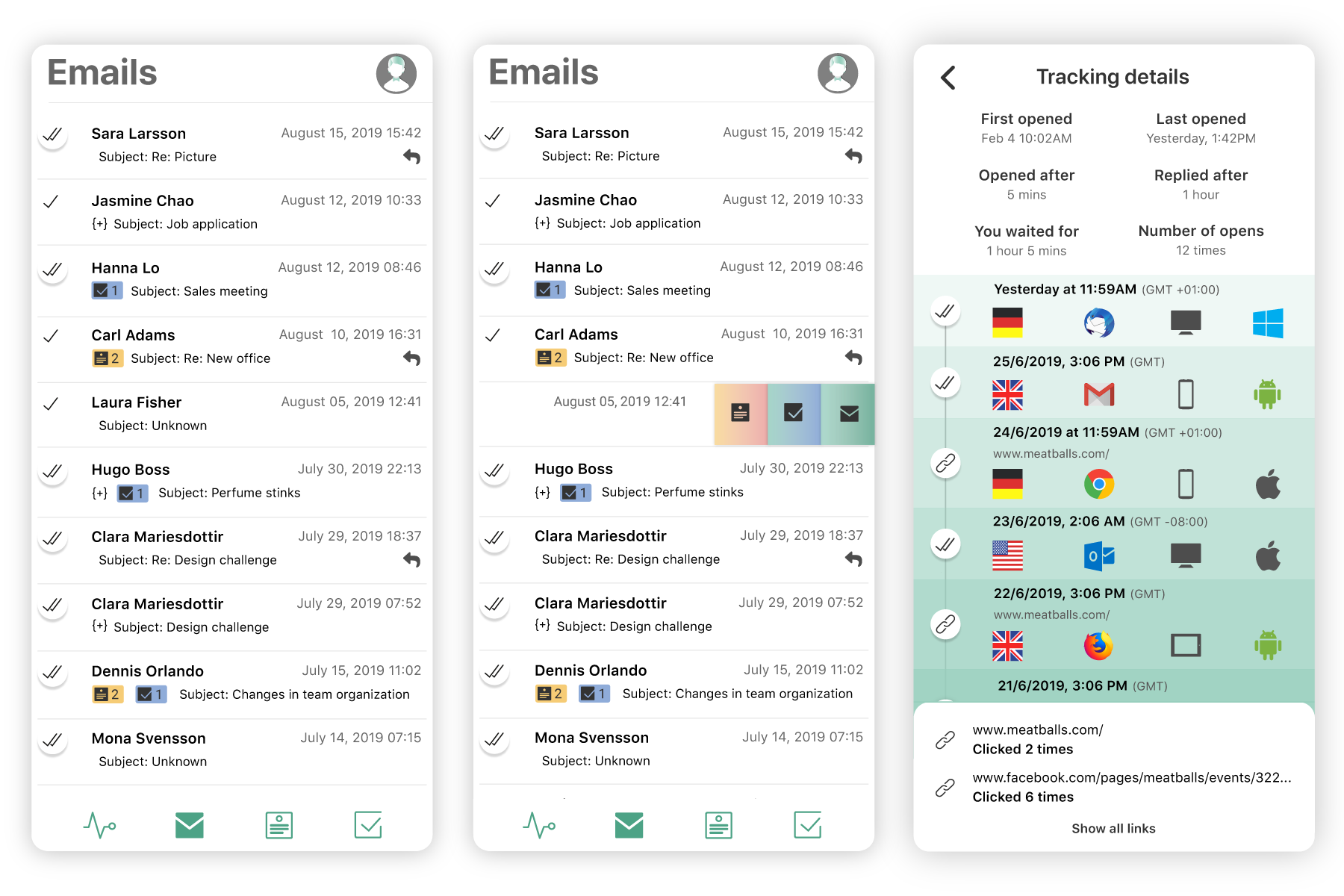
A list of all emails sent with a Mailbutler feature. To open the email or add a note or task to it, you slide the row to the left.
As soon as a tracked email has been opened or a link has been clicked, the user can click the double checkmark/link icon on the left to see detailed information on when, where, and with what device/browser the email/link was opened with.
Conventional email messages are unalterable – once sent, and it is difficult for a user to add new information. Notes allow sender and recipients to easily add information to specific emails without sending a new email. If a note was shared with you, you can only open the email it was attached to.
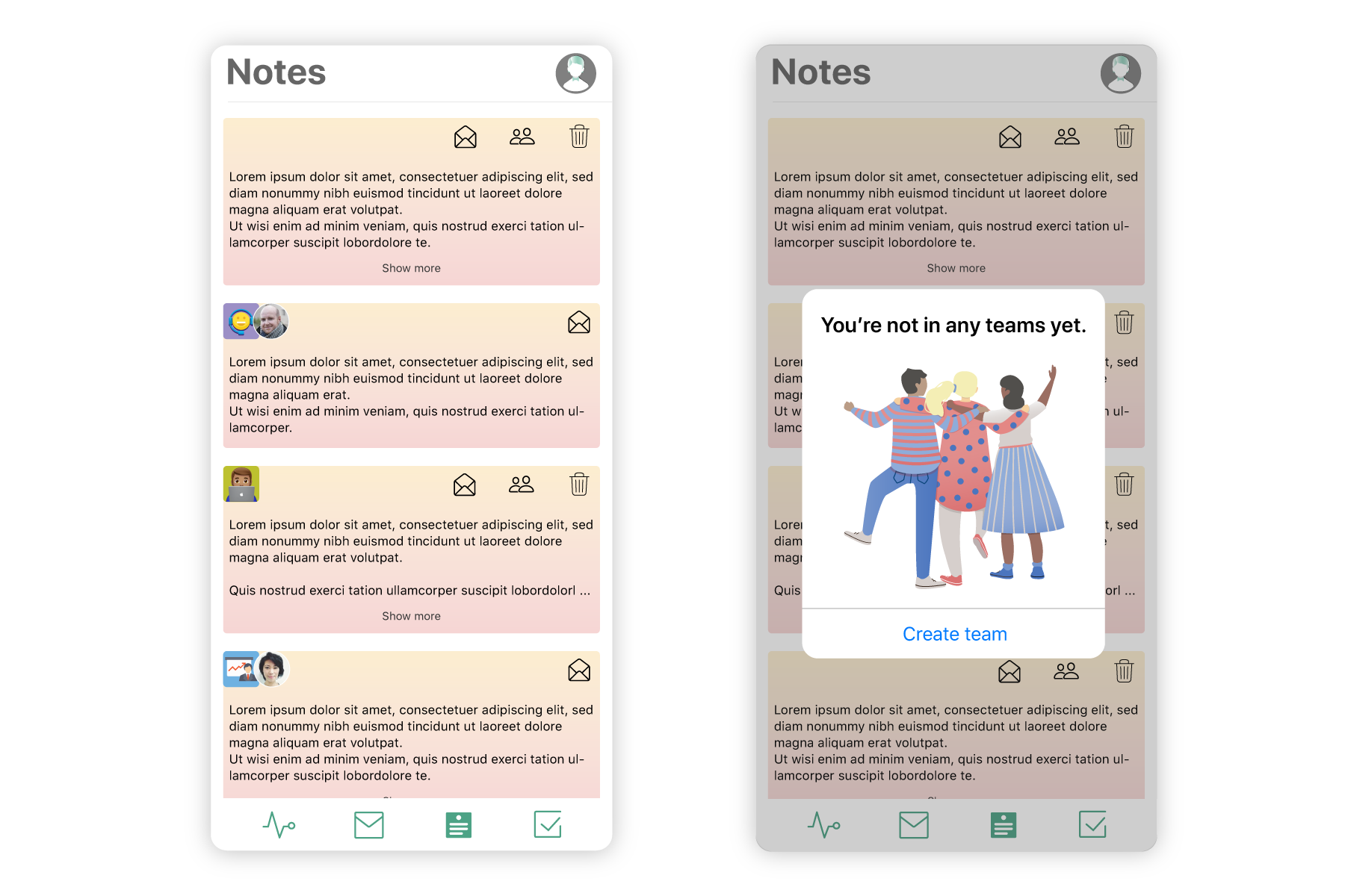
With Tasks, the customer can extend an email message's context by assigning interative tasks in emails. Tasks can be shared with a team or organization and anybody with access to the task can mark it as completed. You can also set reminders so you you can follow-up if the task was not completed in time.
At this point, a beta version of the app was released. Where existing users who had previously been asking for a mobile version, were invited to start using the app and encouraged to report on any issues they might have or give suggestions for features and other ideas.
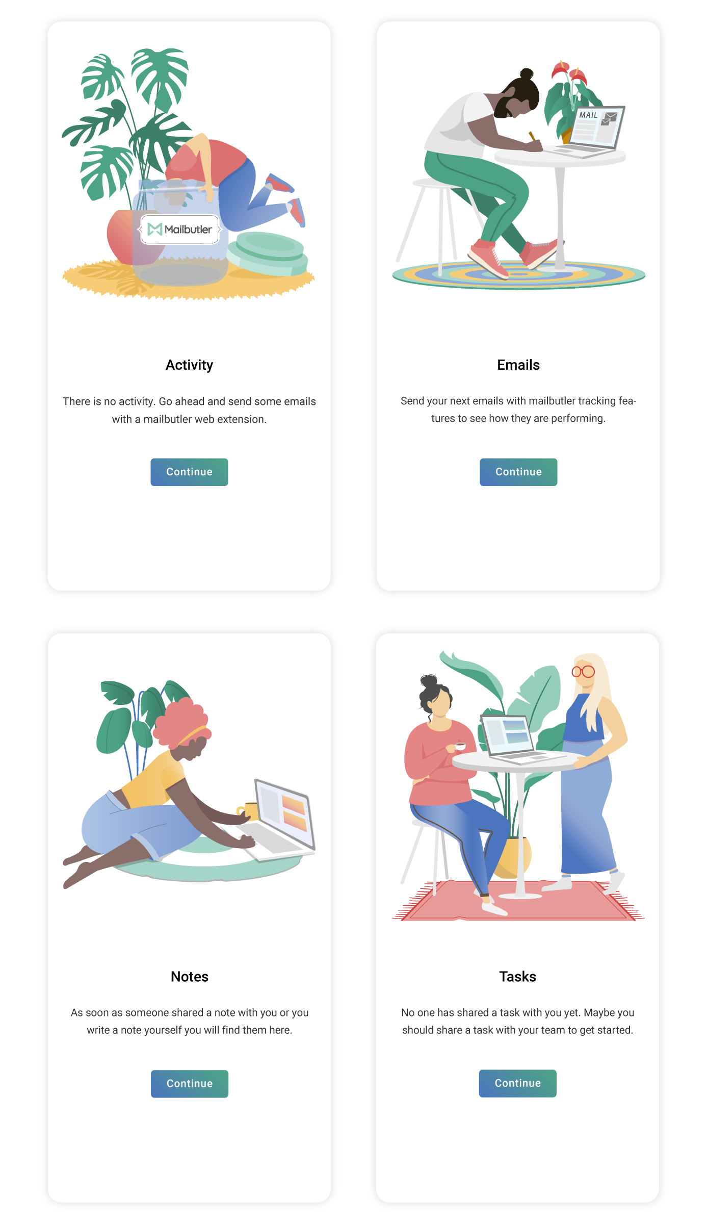
For the public release, empty states illustrations were added to explain to new users the importance of using this app in collaboration with a Mailbutler web extension.
For the release, I developed the overall look of the campaign in collaboration with the marketing manager.
The app was released in September 2019.
You click the floating round button similar to composing an email in Gmail and can add Mailbutler features like tasks, follow-up reminder, signature or use message templates.
