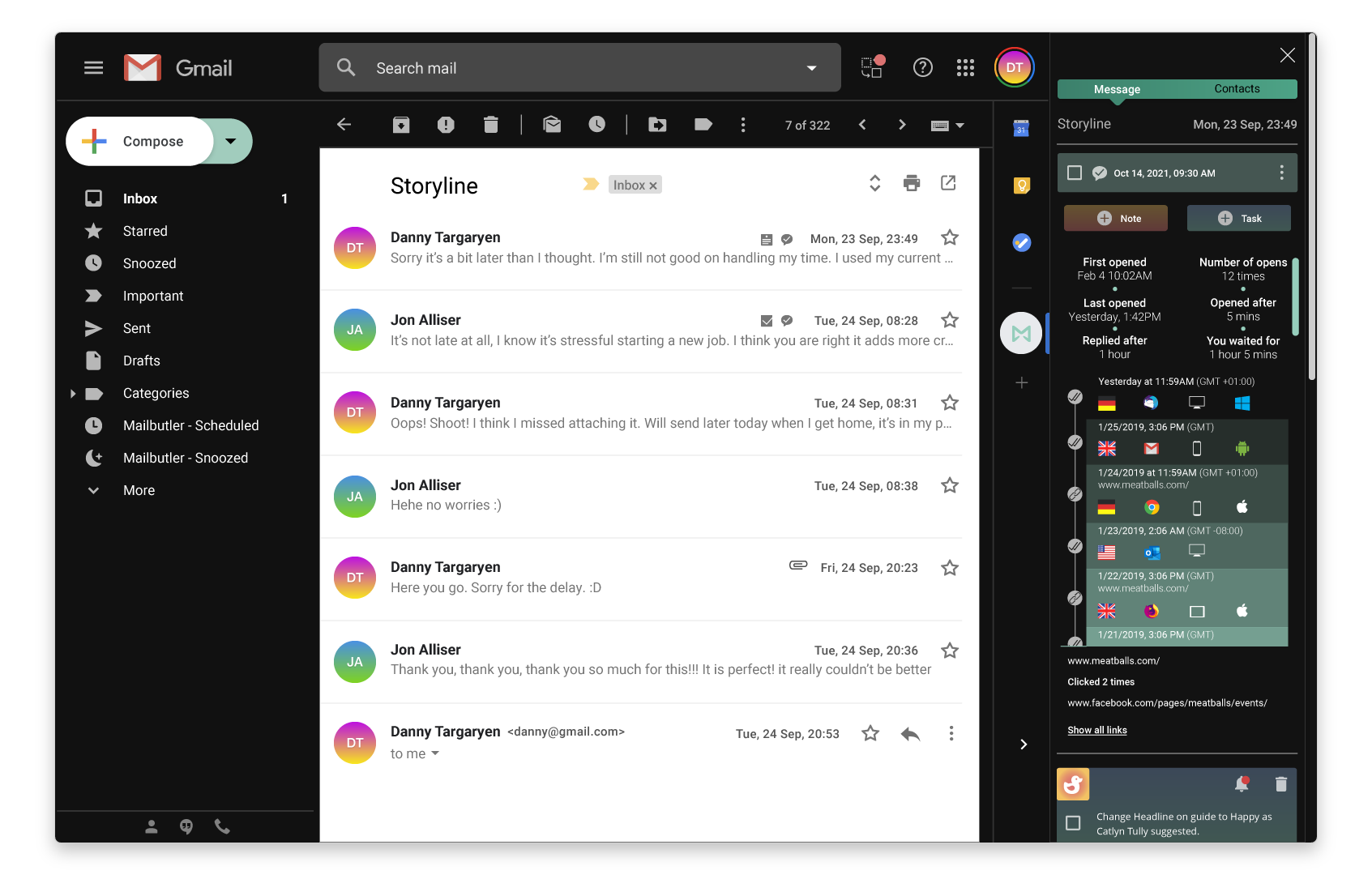
Mailbutler for Gmail is a Chrome extension that supercharges Gmail with a suite of productivity tools, designed to help small businesses send more effective emails.
- My role: I was the only UI/UX designer working with a team of two Developers and a Project manager.
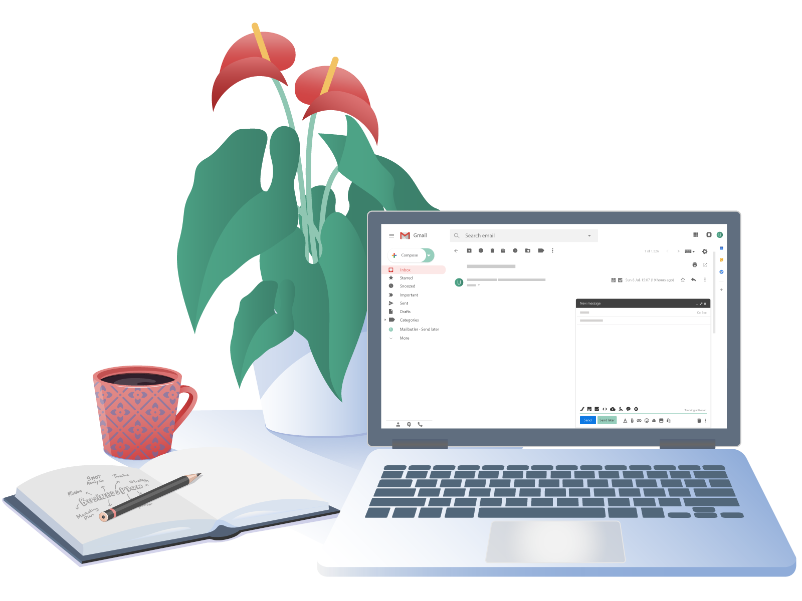
In 2018 Google pushed out a major revamp to its Material Design guidelines. What might have worked before for Mailbutler now felt outdated and the thinly lined icons were not legible.
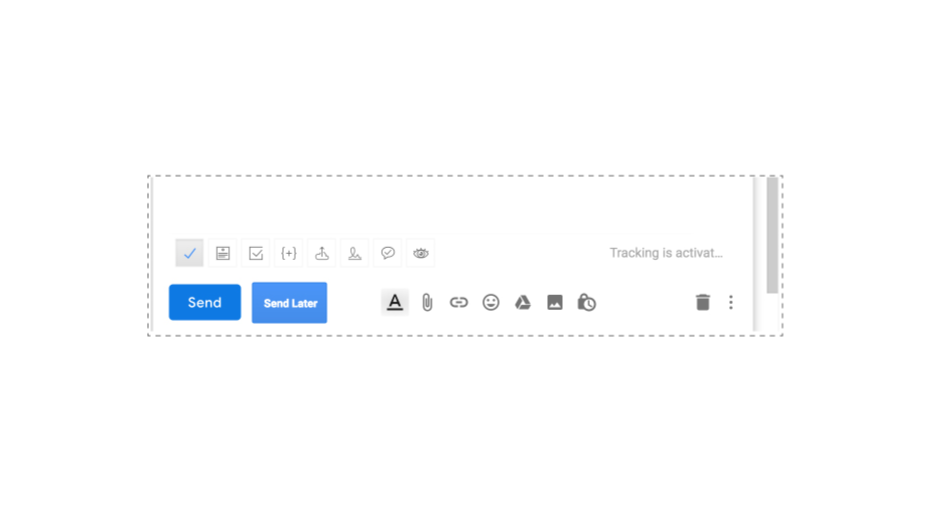
The previously outlined icons were difficult to see in the new interface because of their thin borders. I, therefore, designed new solid styled icons with a similar look so that existing users could still recognise each icon for each feature. But making them more inlined with material icons to match well with non-custom icons in the UI.

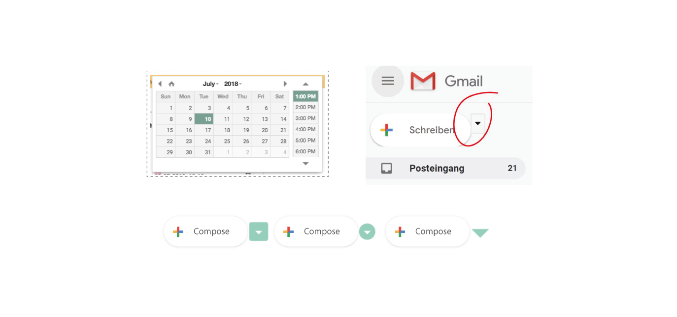
Gmail's redesign also made Mailbutler's UI components feel outdated and were no longer inlined with Google's design.
Gmail's new rounded compose button made it a little more tricky to place a dropdown close to it for quick access to message templates.
The design was made to be transparent so that the user feels like Mailbutler's interface is part of Gmail, while still keeping with Mailbutler's brand.
To do this I used similar UI patterns as Gmail, to give new users some grounds of familiarity to begin interacting with the product.
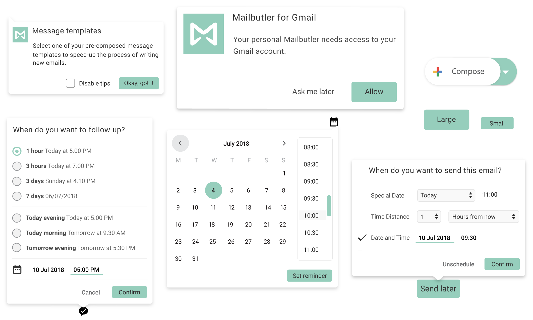
In the compose window where you access most of Mailbutlers features by clicking on icons, I decided to use both Google Material icons for familiarity mixed with custom icons for the actions that Material does not yet provide icons for.
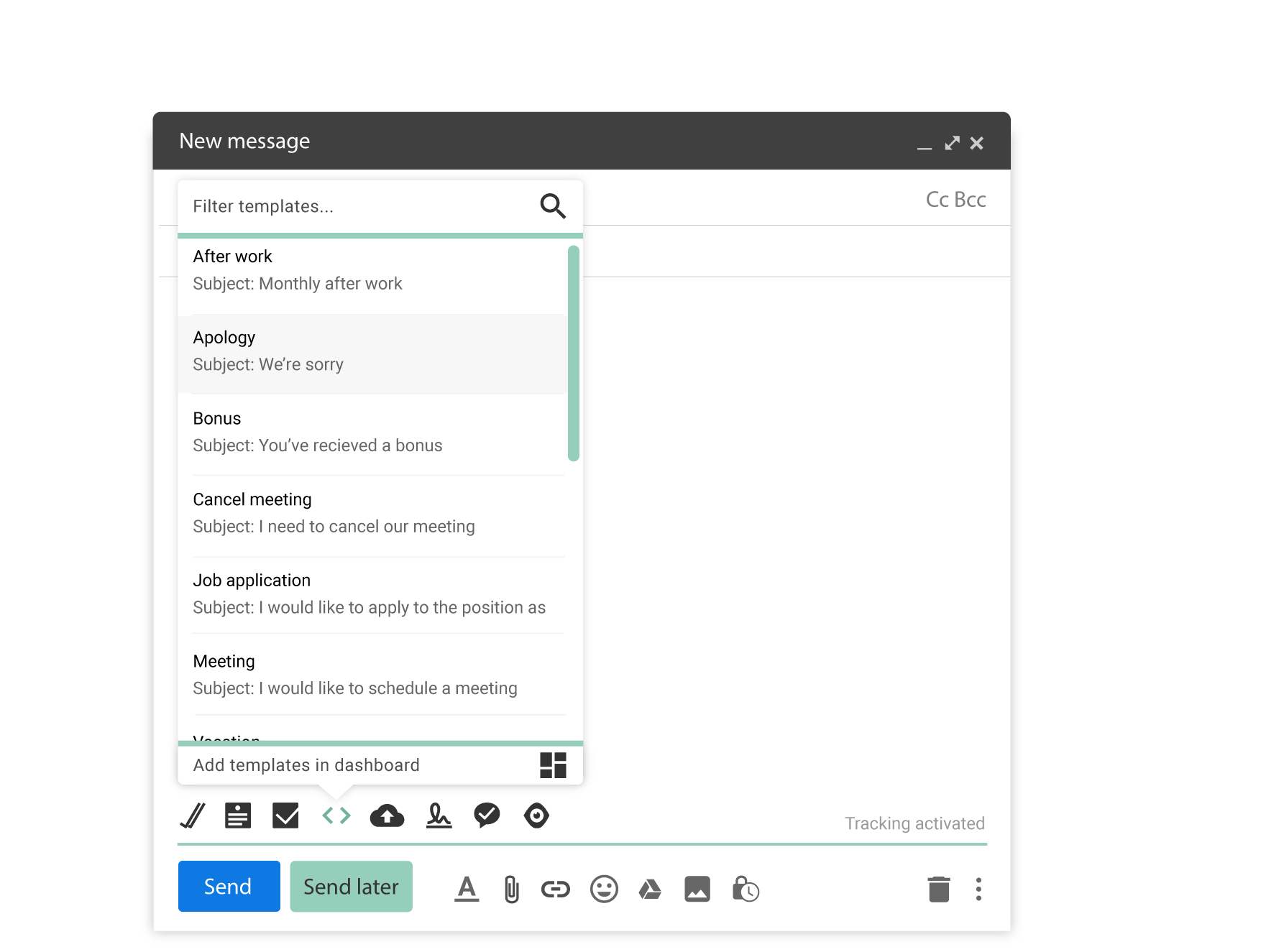
A little more than a month after the launch of the redesign the number of subscribers had increased by 68%.
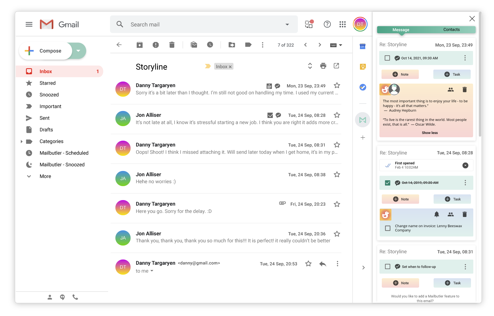
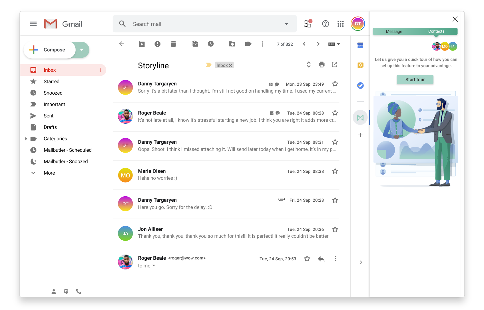
To easier access Mailbutlers features for sent emails, a decision was taken to add a Mailbutler sidebar in Gmail.
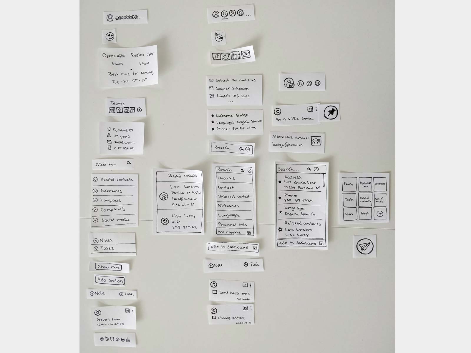
This meant that information and actions needed to be stacked on top of each other which made it very important to research and test the order of the features.
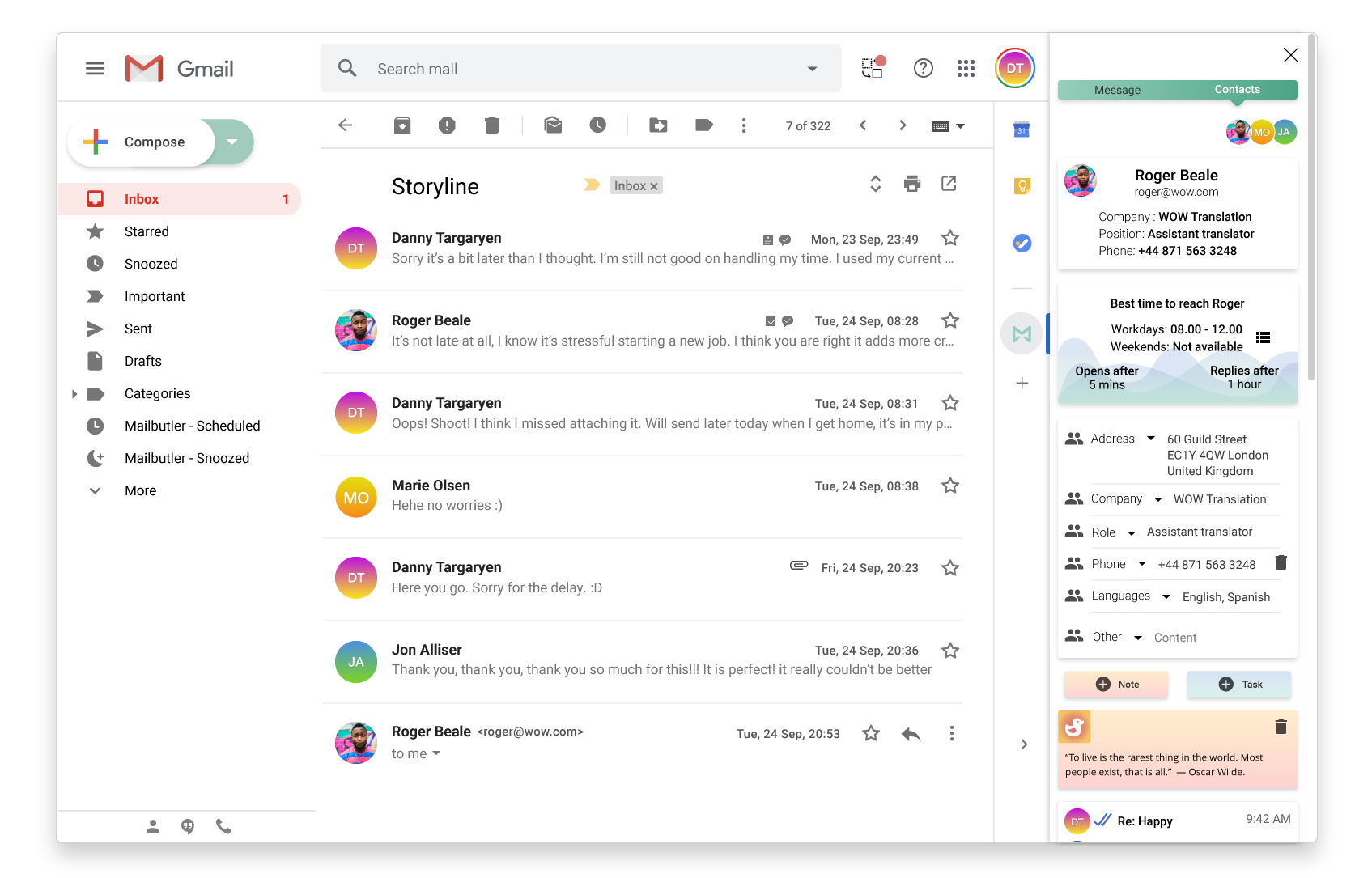
Tracking details, follow-up reminders or Notes and tasks attached to contacts or emails can easily be seen through the sidebar.
The first screen in a walkthrough that guides users on how to set up this feature.
Detailed information on all contacts within an email conversation can easily be seen through the sidebar.
Also designed for dark theme in Gmail here with tracking details.
